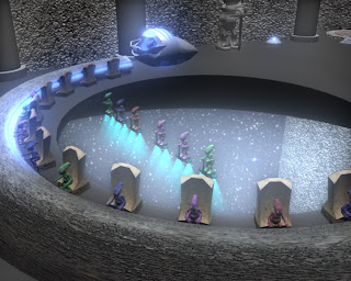
The size of my own room turned out to be ALOT bigger than I planned, and it took me quite a while to get the shapes right.... leaving me with more aliens to animate in less time, but I think I managed to pull through with an animation juuuust about good enough. I think I managed to get the overwhelming church appearance we were goin for.... together with the texturing and lighting it also had a slight gothic feel to it too... sooo, Im happy. I do still think the room is lacking with the amount of things in it compared to the other group members', but I's say it makes a good establisher both in terms of the themes we want to portray, and showing the audience that it IS a spaceship
Overall..... Apart from a few small concerns I have both appearance wise and animation wise with my own room, it turned out pretty good, and the end result for the group animaion as a whole has been quite successfull. Can really see how much better each team member has gotten with using Maya through the course of the project. I think each room in the animation had areas to them which were unique to just that room, and each one had its own sort of texturing style which as a result gave each one a different appearence, yet maintaining the essense of church like structures.... making the space ship even more interesting.
I'd say the only area in the final compiled animation that I really really don't like is the different renedering sizes.... some rooms were rendered in Quantel PAL, whilst others in the default Maya settings for size... so within the final rendered animation we hav transitions which go from full screen to a smaller picture size where there is a thick black border going around the animation.
It's our own fault really for not comunicating at the very end and making sure everyone did the same.... a lesson learned for future projects......
Friday, 30 November 2007
Finished Animation
The animation in general wasn't tooooooo bad... but was a little rushed. It was pretty much all done sort of last minute, and there was ALOT of aliens to be animated... soooo it does need a little touching up in my opinion. But like I said, the animation too bad.
I think I did pretty well with the use of cameras in my shots... an area Im quite confident in. Because we split up the over animation time for the final group animation to 25secs a person, there was alot to show in a short period of time... so it may seem a little quick when first watching too.
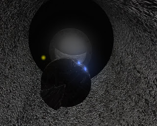
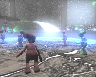
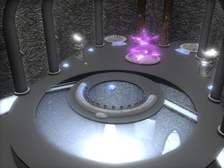
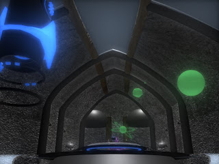
Now that the personal criticisms are outa the way, below are some shots from the final animation......
Storyboard
Now that the room COMPLETE i can put together the ideas I have for the animation to go with it. So..... below is a quickly sketched storyboard of the general structure of the animation. We'v decided that we are goin to use a "glow/fly" thing to show our environments.
The "GlowFly" will enter from the command room which Im responsible for, and curiously make its way through the space ship, visiting every room... and creating some occasional mistchief.....
I havn't detailed in the GlowFly into the storyboard for the command room, just goes through the main shots sequenced, in which the GlowFly will also be seen wandering about......

Modelling Finished
Finally!!!.... the room is completed... although I do think there could be more props and machinery put in to fill it up a bit more. Still... Iv gotten the spacious churchy feel needed... and now!!... I can get to animating the scene, and theres gona be quite a few aliens in my room compared to the rooms of the other group members, purely because my room has turned out a little TOOOO big.....


Development of Modelling
Soooooo..... here goes my Modelling.........
I didn't know we couldn't upload .tiff format images onto eBlogger, so I wn't be able to put some of my earlier shots.....

 To make the bottom floor i had shape up a cylinder to the exact shape of the outer edges which I had made for that floor... then split it up using the Polygon Split tool, and delete un-needed faces, along with th bottom half... so I was left with a flat cut up shape... which i then duplicated, combined with origiginal, extruded edges,aaand merged vertices.....
All that trouble jus for one floor.... and the majority of the room structure was like this to model....

 Creating the ceilings was probably the most hastling part of the modelling phase, because I had to make em by sizing up spheres to the round room layout, and then merge and shape vertices... all before having to move all the vertices into place.... and each individual ceiling section had to be done seperate......


 The arched pillars you see wern't like that to start... at first they were alot more rounded... so I had to change that to make them more church feeling.....


As you can see above, the front ceiling had to be shape in an interesting way as it was to also partly be the window to the ships control room....
 Next I had to cut out a whole for the door.... again by using Split Polygon and shaping up vertices......
 The room so far.....
Next I added a texture to the wall (including bumpmapping), and shaped up the front window, together with ceiling pillars.....

 As you might be noticing, theres random objects ebing placed into the scene.... these are jus things that i am modelling seperate, and placing in th scene as they progress, just so that i get an idea how the room would look......

 Here Im trying out the head from our alien model as a guargoil head.... We decided to have these all across the ship... but in the pic above you can see the original size is waaaaaaaay to small......

 I modelled some armour and a sword for the alien model to create a medievil looking alien statue..... then did some texture tests for it (when imported into room scene, they will be scaled up by quite a bit).......

 The workstation and commander pod modelled, and semi-textured.....
 The room really starting to take form....
 Creating and tweaking hologram texture... with transparency and glow.....

 Some more texturing... the pathways are now also using the same texture as the window areas at the front and bottom of room (Dome below the centralcommand area), and pillars are also textured......
 I jus really like this render hehe...... I think Iv managed to get the hologram textures perfected now... all they need now are projectors!!!!..............

 Deciding on wether to have lights on the outer rim of the room or on the floor.....
 I wen't for the floor hehe......

 Adding some aliens.... extra bits of detailing and textures here and there........
 Waiting to be imported into final scene........

 Pretty much close to completion for the rooms modelling, texturing and lighting.........

I didn't know we couldn't upload .tiff format images onto eBlogger, so I wn't be able to put some of my earlier shots.....

 To make the bottom floor i had shape up a cylinder to the exact shape of the outer edges which I had made for that floor... then split it up using the Polygon Split tool, and delete un-needed faces, along with th bottom half... so I was left with a flat cut up shape... which i then duplicated, combined with origiginal, extruded edges,aaand merged vertices.....
All that trouble jus for one floor.... and the majority of the room structure was like this to model....

 Creating the ceilings was probably the most hastling part of the modelling phase, because I had to make em by sizing up spheres to the round room layout, and then merge and shape vertices... all before having to move all the vertices into place.... and each individual ceiling section had to be done seperate......

 The arched pillars you see wern't like that to start... at first they were alot more rounded... so I had to change that to make them more church feeling.....
The ceiling for the front section of the room (Below) had to be the worst out of all of em... even though by that time I was used to it... it still had a much stranger form to shape, and i ended up making it with a cylynder rather than a sphere like the other ceilings.....


As you can see above, the front ceiling had to be shape in an interesting way as it was to also partly be the window to the ships control room....
 Next I had to cut out a whole for the door.... again by using Split Polygon and shaping up vertices......
 The room so far.....
Next I added a texture to the wall (including bumpmapping), and shaped up the front window, together with ceiling pillars.....

 As you might be noticing, theres random objects ebing placed into the scene.... these are jus things that i am modelling seperate, and placing in th scene as they progress, just so that i get an idea how the room would look......
 Here Im trying out the head from our alien model as a guargoil head.... We decided to have these all across the ship... but in the pic above you can see the original size is waaaaaaaay to small......
 I modelled some armour and a sword for the alien model to create a medievil looking alien statue..... then did some texture tests for it (when imported into room scene, they will be scaled up by quite a bit).......
 The workstation and commander pod modelled, and semi-textured.....
 The room really starting to take form....
 Creating and tweaking hologram texture... with transparency and glow.....
 Some more texturing... the pathways are now also using the same texture as the window areas at the front and bottom of room (Dome below the centralcommand area), and pillars are also textured......
 I jus really like this render hehe...... I think Iv managed to get the hologram textures perfected now... all they need now are projectors!!!!..............
 Deciding on wether to have lights on the outer rim of the room or on the floor.....
 I wen't for the floor hehe......
 Adding some aliens.... extra bits of detailing and textures here and there........
 Waiting to be imported into final scene........
 Pretty much close to completion for the rooms modelling, texturing and lighting.........
Subscribe to:
Comments (Atom)

